Logos. Small but mighty, they have a huge responsibility as they visually encompass who your company is to the world. A design can achieve many things, such as represent the products/services your business offers, become a recognizable symbol to consumers and — most importantly — add personality to your brand!
But what people outside of the design world might not realize is the strategy and process behind a logo design, whether for a completely new brand or existing logo refresh. Will there be an icon? Which colors or stylistic accents make sense for your brand? What will set YOU apart from the competition? All questions our seasoned designers navigate through as their creative juices are flowing.
Made to stand the test of time, a design must endure changes in style trends and company growth. But how long is too long? Truth is, there isn’t a clear answer. A redesign depends on how your company evolves over time. Our rule of thumb: at least consider an update every five years.
At Array, we have had the opportunity to work on quite a few logo redesigns for a variety of clients, and each time the outcome is unique. From slight updates to an entirely new mark, we love seeing the impact a logo can have on the brand it represents.
MERGING TWO COMPANIES INTO ONE
Not every redesign needs to be a completely new look. Sometimes, established brands are just looking for a slight refresh to look a touch more modern and, in some cases, a new design can even be sparked by a company restructure or the merging of two businesses into one.
Array worked with AXYZ International, a global manufacturer of CNC automation systems, on a logo redesign. AXYZ recently merged with WardJet, a waterjet solutions company, and needed to transition to an updated logomark. Both being industry leaders, AXYZ wanted the new mark to incorporate elements from WardJet, while keeping their existing brand quality intact.
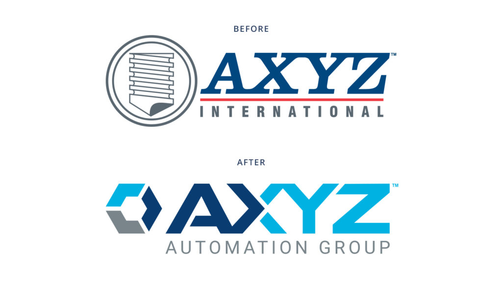 As an update to their previous brand colors, Array brightened AXYZ’s deep navy to match the WardJet blue. We also introduced a contrasting cyan accent, a bold color to be used within the logo and on machines that would stand out from others within the industry. Using a color break and a modern, strong font with sharp lines, the new design conveys the technology and cutting accuracy within AXYZ automation systems. To complete the new mark, we updated the icon by incorporating the new color scheme into an abstract gear-shaped symbol to be more easily identifiable to consumers.
A NEW NAME, A NEW LOOK
In some situations, a merger calls for a new name AND a new look, posing a unique solution. Array took on this challenge with Portal Associates, a newly formed architecture firm from the merger of two existing groups.
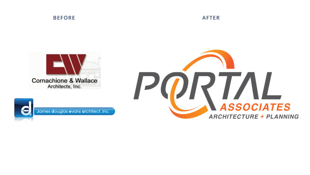 The Portal name was derived from the idea of ‘opening up’ a new level of service to customers by offering an experience of limitless possibilities within design. Stemming off of that idea, the Array team worked to craft a design with modern elements that would represent the new Portal personality. With a grey and orange color scheme in a dynamic font, the mark stands out among others in the industry. An oval shape was added within the logo to represent the portal concept, a fun play off of the firm’s new name.
FROM START TO FINISH
And sometimes a logo redesign is prompted by an issue a business didn’t even realize existed. Last fall, Array hosted an Ugly Logo Contest where brands could enter to win a new logo design. Array selected a winner — a small, female-owned human resources consulting startup — and through Array’s process, it was discovered that their name Kite & Company was already in use by another group. After a few rounds of brainstorming and trademark searching, SyncHRa Solutions was created, conveying the concept of inside and outside teams seamlessly working together in synchrony.
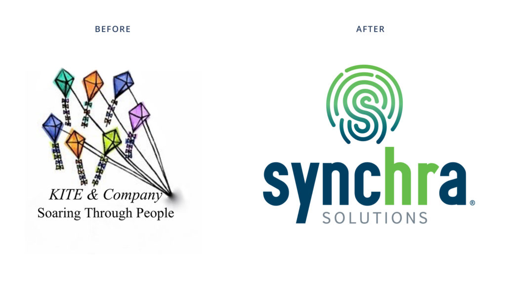 With a name in place, Array went to work developing a logo. Inspired by the individuality of a fingerprint, we created a unique s-shaped icon representing a ‘hands-on’ approach. The mark also features a trendy bright green and navy color scheme for a forward-thinking, professional feel. From start to finish, Array helped SyncHRa Solutions showcase their expertise and stand out from the competition.
FOR A GREAT CAUSE
But helping brands isn’t our only motive. We strive to give back by lending a hand to nonprofit clients in need of revamping. Recently, we worked with Hannah’s Haven, a Teen Challenge Center that uses faith-based practices to help women struggling with substance abuse recover from addiction.
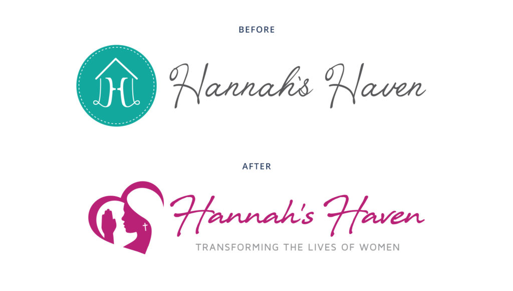 Guided by the Hannah’s Haven team, Array redesigned the center’s identity, using elements that best represent their core mission and values. The new logo portrays a woman’s prayerful silhouette, representing the African-American community that Hannah’s Haven serves. She is also wrapped in a heart shape to convey God’s love, guidance and healing strength. The raspberry-colored icon combines a symbol of Christianity with the sanctuary of safety that Hannah’s Haven brings to women. Array is hopeful that the new design will assist Hannah’s Haven in connecting with more women in need of help.
At the end of the day, we strive to find the best solution for your business. Whether it be a small update, a new look or a unique solution tailored to you, we can help. And don’t worry, if you’re not sure exactly what you need, count on Array’s branding expertise to lead you in the right direction!